
Case study

The case study I’ve chosen is a digipak of the album “Loud” by the famous singer Rihanna.
It is the fifth studio album of her. It has been released on November 12, 2010.
The overall theme of this digipak is love/lust, which is presented as she might be distressed about a relationship she is in or she just broke up with someone.
I chose to analyse the digipak of Rihanna because my first impression of the album was really good. You can see her on all of the pages but she never makes eye contact except on one page. That gives a mystery appearance and I really wanted to know what is behind the cover.
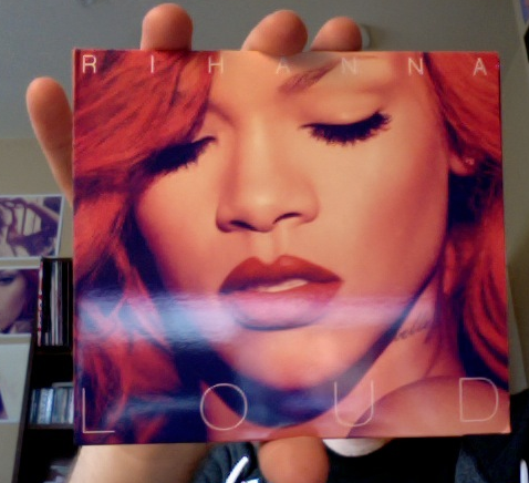
Looking at the front cover of the digipak you can tell that the selling point of this album is Rihanna
due to her worldwide fame. The first thing you can see is her face. She doesn’t look into the camera, her eyes are closed which give Rihanna a confident and energetic look and make the reader want to know, what is behind that cover.
The colour red is dominant on the album cover through the singers hair and lips. There is a red cast all over the whole album because the colour red is warm, shows sexiness and is seductive.
The title is written in a thin, capitalised and san-serif font, that shows a sophistication because of the simplicity. The type they used is kerned.
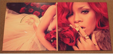
The bit when you open the cd cover is vibrant red, such as the front cover. The close up of Rihanna is voyeurism of her, because the red colour makes her look romantic and attractive. The way she looks in the camera show, that she knows that she is sexy. The rose she is holding in her hand has been reflected on the other pages of her album. That gives the whole thing a recognition value and a trade mark for her album.
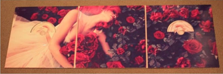
The inside of the cover is mainly designed in the colour red, as you can tell from the whole digipak which links the genre of the album. The picture is a continuation of Rihanna lying on
red roses which grabs attention and makes her stand out so she looks pure and joyful.

The album includes two CD’s, which are positioned at the inside of the cover.
They have a graphic image of a light pink rose which contrast against the ones Rihanna is lying on, to show sense of variety. The light pink shows a soft feminine feeling, which signify friendship and relationship, showing a balance in the themes of the album.
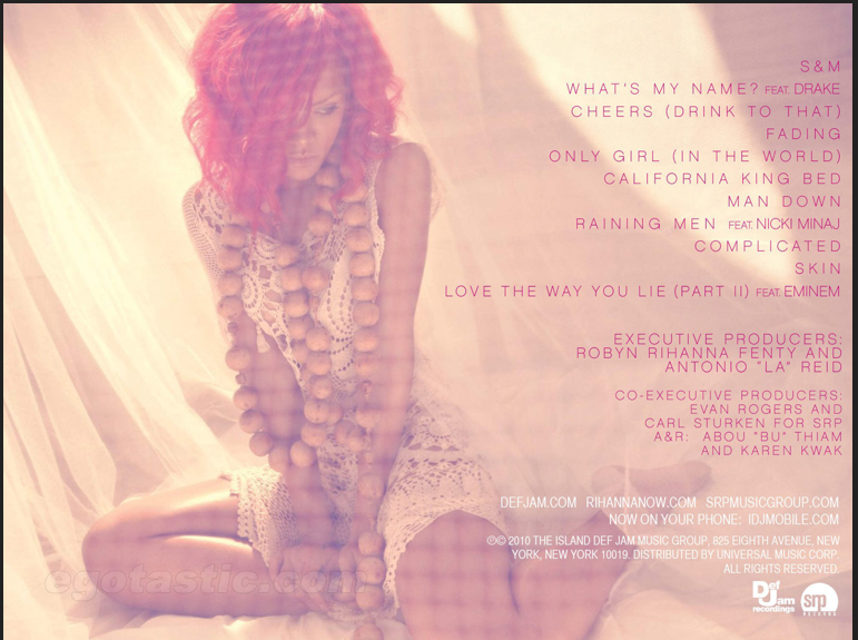 The back cover of the digipak is more of a fade pink. Rihanna is on the cover again, but she still doesn’t make eye contact, like she is shying away. She is wearing a dress, which is really short which gives sex appeal.
It looks like she is sitting on a bed, with curtains around her, which looks like a canopy bed. She could have chosen a picture like that, because it fits to her song “california king bed” which is included in the album, because the bed looks like a more higher status bed.
The song titles are listed in the right order and are written in a sans-serif font with the same red tone as her her is. It also says who the producers are and which label it was recorded with.
Case Study
The case study I’ve chosen is a digipak of Fleet Foxes. They are an indie folk band that formed in Seattle, Washington. This album won an award for the best album artwork in 2008 beating Coldplay and Roots Manuva.
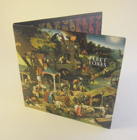
When you notice the front cover on the digipak you see that the painting is drawn very interesting due to the fact that each scene tells its own little story and there is so much to see. They might have chosen that, because in each song they tell a different story so every song theme is included on the front cover. The art used on the front cover is a segment of Pieter Bruegel’s from 1559.
The band name is written in a quite small serif font type, that could be because the thing that catches your eye first should be the art work. It intrigues, attracts you and draws your eye, then you find out who the artist is.

The back cover of the digipak is also interesting: you can see that the track listings on the back of it run onto each next line regardless of whether each word is finished, showing that it is an alternative style of music.
The track names are written in capital letters with a serif font. The background is black and the track listings is written in yellow. That is rather a natural colour which conveys calm, almost hymn-like, religious nature of the music.
Interestingly, the painting from the front cover runs over onto the back cover by about six centimetres. This different approach of the design of a digipak shows the alternative genre that this band belongs to.

This print continues across the whole inside of the digipak and is also seen on the CD, however it is not the same way up on the CD as on the inside of the digipak. This might be in order to show the alternative feature of the music. This contrast of culture shows that the music is different as it does not follow all conventions.
 There is a pull out booklet with the lyrics in and they are not printed anywhere on the packaging. However, the band’s website is displayed on the back cover so if a fan want to find the lyrics or find out some more information about the band, they can do it easily. The CD has the same pattern on it as the inside of the digipak, but this time it is only in black. The background of it is greyish, so you can’t see the pattern very easily. The name of the album is written in a white font, exactly the same as on the front cover. That gives a recognition value.
No comments:
Post a Comment